ratcreature: Who needs talent? Enthusiasm is fun!  (talent/enthusiasm)
A couple of weeks ago I borrowed Drawing and Painting Fantasy Beasts by Kevin Walker from my library (or rather the German edition of this), and I found it quite useful and interesting overall. Basically it's just a bunch fantasy creatures drawn as examples, but each creature comes with about four pages of step by step process description of the techniques used, and the different sketches and stages that went into the final work.

Initially I got it because I had never painted with acrylics, but generally found hobby painting books about acrylics my library had rather useless and boring. I mean, it's not that painting with some new medium was like repairing a motorcycle or any of the other things for which you really need either direct instruction or a book rather than just muddling along, and there's only so much variation to the theme of "you put color pigment on a surface" anyway, but this book has a neat introduction section that just lists different techniques with a little picture of how it looks, which makes it easier to try things than unguided trial and error and I'm lazy like that. Also I wanted to do dragons anyway, and this has examples of fantasy art done with acrylic paint (other techniques too) with step-by-step pictures, so that seemed like a good match.

The first part of the introduction is just the usual list of drawing and painting materials, and rather pointless. Frankly I wonder why nearly every such book feels the need to recap materials in a generic manner at the start. I mean, if you pick up a specialized drawing book you are most likely aware that there's a difference between watercolors, gouache, acrylics and oil paint, and that pastel chalk is different from oil pastels and so on. It's not that I haven't picked up some useful general info from skimming these chapters, because every now and then one will mention something I hadn't know of before, but overall I find them superfluous. Still, the list introducing the materials used is only four pages in this book, so it doesn't dwell, and then the introduction gets more specific with the neatly ordered examples of actually using the materials.

The main part is sections with fantasy beasts sorted by regions in which they supposedly live, and realized in a variety of techniques, both traditional and digital, though most involve acrylics or acrylics mixed with other media. I suspect that if you are already really experienced this book won't tell you much new, but since I've only started using acrylic paint it was useful to have illustrated examples like this for achieving different effects and textures, and getting ideas on what to do, though I have only tried a couple so far.

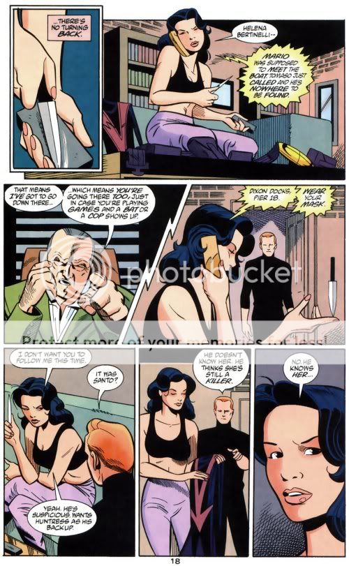
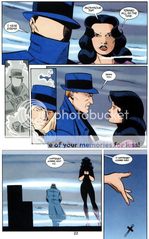
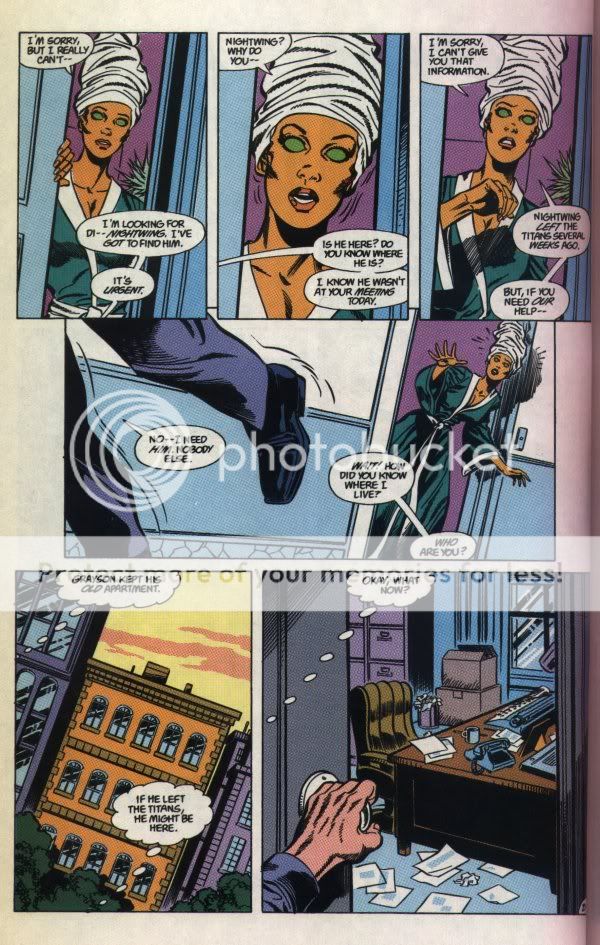
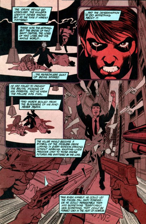
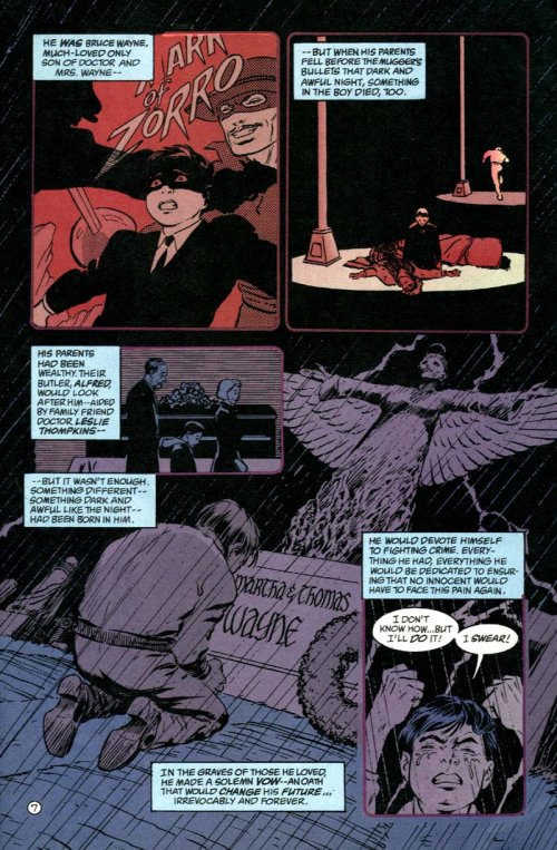
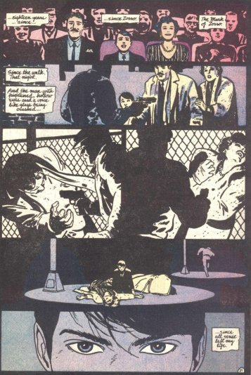
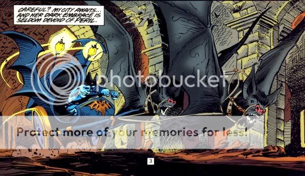
I've scanned a couple of pages to give you an idea of the way the process descriptions and illustrations look like, though obviously if you don't speak German the text of these scans that explain what was done in each step won't do much for you.
a few example pages behind the cut )
ratcreature: RatCreature at the drawing board. (drawing)
I've posted new prompts at [info]slothsdraw, which I'm crossposting here because for these prompts I also put up 18 pages of scans from a couple of drawing books' sections on body language, and I thought that might be of interest for others who like to draw, even if they haven't joined the community.
ratcreature: RatCreature as zombie. (zombie)
First, the whole Harry Potter thing is making me jittery. I haven't sought out the leaked copy because I'm not about to slog through hundreds of pages as crappy photographs, that's just unpleasant for reading. Not to mention that I don't really reread the HP books, so I'd rather read it the one time as proper book. But it is hard to keep away, knowing other fans have already read the book and are talking about it, even though my f-list is good with not spoiling me so far. (*insert the obligatory dire threats here*).

I will only get my copy on Saturday and I'm not the fastest reader, so at the earliest I'm going to talk about Deathly Hollows on Sunday if at all, and then I will of course use cut-tags and be very careful not to mess them up accidentally.

But until then I definitely need to distract myself with fandoms besides HP-- those still exist after all, even if half of my f-list apparently decided to avoid LJ and sometimes the internet entirely to be on the safe side. Anyway, thus I'm going to talk some more about Batman comics, in particular:

Year One: Batman/Ra's al Ghul #1-2 (written by Devin Grayson, pencils by Paul Gulacy, inks by Jimmy Palmiotti)

One of my main reasons to buy these (besides being a general sucker for all Batman comics DC publishes) was actually that I found the three color covers (black, white, and red) really attractive. I like the interior art okay too, but not as much as the covers (take a look at cover #1 and cover #2). If only the story had lived up to the packaging...

For the sake of my sanity I didn't even try to figure out why this is published as "Year One". I don't think this is supposed to fit in Batman's "Year One" or even just his early career, but rather after Batman: Death and the Maidens? But I don't have Ra's al Ghul's backstory that present. Maybe it is because of some flashbacks in the comic, and those could be made to work somehow in his first year.

First, while the basic idea that the Lazarus Pits affect death and life's balance in general was neat (even if what exactly their connection is was never really explained in any remotely consistent or logical way), the plot built around this was too thin for 96 pages. On the bright side, it had zombies, which is always a plus, but I can't say I enjoyed much else.

And even the zombies weren't particularly great specimens. Okay, so destroying the Lazarus Pits somehow stopped and even reversed death, thus the zombie problem, but I didn't really get why that particular horde of disgruntled undead was after Batman.

The action sequences were plain confusing sometimes, like when Batman was running from the zombies I had no idea how he suddenly got into the Batmobile again after, or if that even was still the vehicle he started out in earlier that night, which was definitely a car not some sort of glider. Yet later his vehicle could suddenly fly. Traditionally the car can't, right? So maybe what he used then wasn't the car, but some magically appearing Bat-Glider or whatever that was supposed to be, that we don't even see him remote call as far as I could tell. Maybe the Batmobile car transformed into a glider.

I also didn't understand what happened to the zombies he lured into that supermarket, did he lock them up there somehow? I couldn't tell, later it seemed he did lock them up, leaving them to rampage there, but why didn't they smash the glass?

Other times the action was just boring. You can tell that a comic has too little plot if it shows a frelling snowmobile chase over eight(!!) pages. Eight. I like certain kinds of action in comics, but snowmobile chases just don't come across that well in this medium. Certainly not if they last eight of the 48 pages in an issue and that on top of other chase scenes. And in a fairly pointless flashback at that.

Anyway while we get zombies, we don't really get to see Batman fight them for plain zombie fun, he flies flies around the globe interspersed with boring Ra's al Ghul flashbacks about some magical peach, and then Batman happens to find a monk chanting the Lazarus Pit formula, yet Ra's al Ghul followers were too stupid to figure that out... The whole thing made no sense to me.
ratcreature: Say no to creatures (& women) in refrigerators. (refrigerator)
[livejournal.com profile] brown_betty asked for examples "to illustrate the exactly how and why female comic characters are illustrated differently than the male." And I thought, really, what's better to illustrate these things than the books teaching the style in the first place?

A while ago I posted some scans from Wizard How To Draw series on drawing female superheroes (here and here), and I thought I'd post a bunch more from the first book of the series on "How To Draw: Heroic Anatomy".

There's 19 large page scans behind the cut... )
ratcreature: grumpy (grumpy)
A while back I posted about women characters in the Wizard How To Draw: Character Creation, however what I didn't really notice at the time (and that says a lot about my own blind spots), but which leapt out to me today when I happened to leaf through it, is that once again there are no non-white characters in the whole thing. Okay, that is not quite true, there is one black guy in Gene Ha's chapter on "Brutes", and in Scott McDaniel's chapter on "Costumed Vigilantes" a bunch of gang members could conceivably be non-white, though with McDaniel's stylized drawings it's hard to tell for sure without coloring. But otherwise, nothing.

Seriously, wtf? I mean, as I have noted in an earlier rant it's not that unusual to find drawing books that show only white people, but most of the "classics" have at least the excuse that they're reprints from some time between 1920 and 1960, this book has been published in 2006. And worse, it's not just about anatomy, but about character creation for comics, and not even mainstream comics are that bad. I suspect that unlike with the women characters (see my post linked above), they might have been reluctant to include the most cringe-worthy cliches and thus ended up with sticking just with white characters, but I think even an Asian ninja guy would have been better than this.
ratcreature: Say no to creatures (& women) in refrigerators. (refrigerator)
This is a scan from Wizard How To Draw: Character Creation, from the chapter Super Women

one scan, about 85k )
WTF? That woman on the left looks freakishly disproportionate, not attractive, not even if you like larger breasts. And that thing with the ashamed body language of the normal woman left me speechless. To be fair to the book as a whole a few chapters onward in another section on female archetypes titled appropriately "Vixens" (sic!) the same approach to drawing breasts is actually mocked, so strangely enough the example "vixen" drawings have thus smaller breasts than usual for superhero comics. Go figure. Anyway, so it's not consistently advocating freakish balloon boobs.

However that in the archetype section the chapters are Super Men, Super Women, Acrobats, Costumed Vigilantes, Brutes, Vixens, Armored Villains and Sidekicks, and the only chapter with examples from both genders is the one about acrobats (by Adrian Alphona, who draws Runaways), is quite telling. I mean, talking about archetypes I kind of get why they wouldn't think of women as typical examples for brutes or even armored villains, but no sidekicks and costumed vigilantes either? *grumble*
ratcreature: RatCreature begs, holding a sign, that says: Will work for food, with "food" crossed out and replaced with  "comics". (work)
Since there seemed to be interest, I scanned a few more pages, i.e. the sections on dramatic tension, on emotional impact and on tension & pacing.

there are ten fairly large page scans behind the cut )

Also from the noise outside I guess Germany won against Poland?
ratcreature: RatCreature as a (science) geek. (geek)
A couple of people expressed interest in taking a look at the Wizard How To Draw: Storytelling book I mentioned, so I scanned two sections which I found quite interesting and which also might be useful as background for comic meta and such, i.e. Pacing a Scene and Pacing an Issue.

there are eight fairly large page scans behind the cut )

Obviously it's not so much analytical as examples demonstrating techniques. So what do you think, is this kind of thing helpful for your comic meta/analysis/whatever?
ratcreature: RatCreature at the drawing board. (drawing)
Getting facial expressions, especially more subtle ones right, drawing them so that they are immediately recognizable as exactly what you want is really hard. There's a couple of reasons for that, for example that we are very well trained to read facial expressions and the slightest changes will make an immediately recognizable difference, while at the same time the subtle clues in faces (things beyond the smile/frown line of the mouth and perhaps eyebrow position) aren't something one is all that aware of. Also, not all "stages" of facial movements are equally recognizable, that is, sometimes facial expressions without more context clues like body language don't look like much of anything, so you have to "freeze" the right moment for a drawing. I mean, if you have a series of photos showing a laugh some might just as well look like someone crying and not a recognizable happy crying either. OTOH if you exaggerate too much it will look fake and ridiculous, even in comic-like drawings.

So a lot of the time, at least for me, it's trial and error, like, I have a vague idea what the face would look like, and then if I'm lucky I manage at some point an expression that looks right. Sadly by that point it's likely to be one smudged pencil line in a whole bunch of former attempts that finally makes it look good, and then when I try to trace it in a clean copy using a lightbox or clean it with the computer, or ink it...the expression suddenly is lost again.

Anyway, so I wanted to know more and have a systematic approach as a reference for expressions, and Gary Faigin's The Artist's Complete Guide to Facial Expression does exactly that. I haven't fully read through all the sections yet, but what I have read so far is really helpful, because the illustrations point out step by step which part of the face changes, which muscles do what, analyzes failed and successful examples of artistic representations of emotion and explains why one failed, while the other invokes true emotion, and there's lots of attention to detail. Like what exactly makes the difference in lowered upper eyelids between a lowered gaze, and varying degrees of sleepyness. Or like how you can make eyes look in the distance, look at something nearer, or into an inattentive "inward gaze". Or like explanations how age affects the face and details of expressions.

The book has three main parts: The Structure of the Head, The Muscles of Expression, and the Six Basic Expressions. The first part briefly recaps the proportions of the head, the bones in the skull and how those reflect in the facial planes, and how to construct facial features. That section had mostly things that I already knew, and that I guess most people who have had a portraiture lesson in high school, or read a decent book on drawing humans will also know, but he's clearer than many others with his descriptions and explanations, and I haven't seen some effects of age explained quite as clearly before, either.

The second part, The Muscles of Expressions, lists eleven key muscles of facial expression and then examines what each muscle does to the face separately, as this are the elements he comes back to later when the full expressions are analyzed. The sections look at a muscle group, first showing it in a drawing of a skull so you can see where it attaches, then show it overlaid on an actual face (like here for the sneering muscle), and then show it in action, i.e. first how the face looks with the muscle relaxed, then how it creates expression, in different degrees of contraction. What I found helpful is that it also shows this from different angles, like not just how a frontal frown looks like, but also how it looks from the side (to see this for the sneering muscle look here, here, here and here). And it's really detailed, for example the section of the muscles of the eye and brow is 24 pages, the one explaining the mouth 36 pages (also covering different neutral/resting looks these features have in different people).

The third part, making up more than half of the book, finally covers complete facial expressions, those are sorted into six basic expressions, which are then further divided. He intentionally leaves out expressions that he calls "subjective and circumstantial" because showing the face only people ask to name the emotion in photographs won't agree what it show. Examples Faigin gives for this are greed, vanity, shyness, jealousy, pity, disappointment, remorse, suspicion, stupidity... because the face without any body language (or other context) will be ambiguous. He calls those "circumstantial expressions".

Anyway, the basic ones he distinguishes are sadness, anger, joy, fear, disgust and surprise. He then covers variants, and degrees to each of those. For sadness he distinguishes: crying with open and closed mouth, nearly crying and suppressed sadness (I found it particularly interesting how the tight lip stifling an emotion looks slightly different for tight-lipped anger, a suppressed smile and suppressed sadness, I wasn't aware of that difference), then the pout, and sad expressions involving only the eyes with a neutral mouth (sad smiles are covered later in the "complex smiles" section).

Anger is grouped into: rage (with different versions of angry shouting mouth, and clenched teeth and snarl), anger with compressed lips, anger with angry eyes, but not-angry mouths, lesser angry expressions that then come across as stern and intense. I found it really interesting when he pointed out how the widening of the eyes combined with the angry eyebrows causes the shape of the visible white in the eye to change into an distinct shape so that we can recognize anger just from that, and also the degrees of the angry glare that make eyes go from neutral, to just intense to truly angry.

For joy he covers laughing, overjoyed, open mouthed smile, then varying degrees down to the slight smile, stifled smile and stifled laugh, complex smiles , i.e. mostly those having different eyebrows than pure smiles (happy/sad, eager, ingratiating, sly, debauched, closed eye), and stresses the importance of making eyes and mouth match to express joy, because otherwise you get a fake smile or forced laugh. I found the eye details pointed out helpful too.

Fear is covered from most intense through least intense, i.e. terror, very frightened, frightened and worried. Disgust likewise, from extreme physical disgust with retching, to physical repulsion, mild disgust, and finally disdain. Surprise is covered last and has fewer variants, just open mouthed/slack-jawed, the mouth forming an O, open-mouthed but joyful, and merely in the brows.

Finally he concludes with a table showing all covered emotions and the involved muscles and signature wrinkles in brief (this is an example page from that table), and in that section also gives a tabular overview of expressions of physical not emotional states, like pain, exertion, yawning, drowsiness and such.

It's a very cool book. My only quibble with it is that the green overlaid color is on some pages slightly out of alignment in my copy, as you can see in some of the scan. It's only a few millimeters but that kind of printing fault shouldn't happen in an art book. It's nowhere bad enough to impede usefulness or legibility, though.

Anyway, I'm really pleased with this book and I hope the example scans give an impression of why it's worth buying.
ratcreature: RatCreature at the drawing board. (drawing)
Remember a while ago back when I posted this scan of a kind of terrifying smiling Wolverine that was an example in the Wizard How to Draw: Heroic Anatomy book? Well, back when I first leafed through the book I was also pissed off at the chapters on drawing women (at some chapters more than others), but I couldn't quite figure out what exactly annoyed me so much, since it wasn't just straightforward sexism bothered me.

Not that that is absent, but it is a Wizard publication, and those chapters are explaining how to draw conventionally "beautiful" and "attractive" women for comic books, so it's not like I expected much in the way of feminist consciousness or anything. The mere fact that there are four chapters in the anatomy section on drawing women that have no equivalent for drawing men in their book is quite telling. The chapters in question are "Women" (by Joe Linsner), "Sultry Women" (by Adam Hughes), "Realistic Women" (by Terry Moore) and "Sex Appeal" (by Michael Turner). And yes, the one on sex appeal doesn't mention men at all. There's another one called "Superheroic Women" but there's also a chapter "Superheroic Men". Since the book is actually not that bad with including women as examples in the other chapters dealing with "regular" anatomy (hand, feet, faces, muscles, etc) compared to some other drawing books I've seen (like I mentioned in an earlier entry), it's unsurprising that the "special" chapters deal with women as sex objects.

I found the presentation somewhat bizarre in places, because clearly a lot of those sections were intended to come across as a bit self-mocking, only, well... I think an example will show what I mean. Here's a page from the chapter "Women" with the subsection for some reason called "The Triple Threat" (threat? wtf?!?), pointing out that main areas of interest in the blunt approach to creating attractiveness (from the heterosexual male POV) would be breasts, ass (they printed "butt" of course *eyeroll*) and legs. Duh. Who would have thought. I mean, that paragraph doesn't even explain anything about drawing any of these, so why include this? Actually Linsner explains at the beginning of the chapter that he's just going to explain what features he finds attractive in women, and is not actually going to talk about, you know, drawing these features. He continues for two more pages in a similar way, pointing out that eyes, hands, lips and hips were also attractive, and at the end I was mostly "whatever", but not all that aggravated.

That changed with the next chapter "Sultry Women", in particular with this page. The point this is trying to make about breast size and that larger breasts won't necessarily look better is fair enough, however it could have been done in a less offensive manner, that doesn't point to the example that fat women also have large breasts and of course "fat=ugly" is assumed as a given. I mean, in his chapter Terry Moore managed to draw examples that exaggerate the same problem (unrealistic breasts) along with some others, like here and here, and show how it doesn't really look good to draw women this way, without being that offensive.

But I realized that what aggravated me so much wasn't just the "fat is obviously ugly" aspect of that picture. While I'm not into the anorexic look and also think that what looks good in terms of weight, build, curves... whatever, depends a lot on the individual woman (or man), I'm not above conventional ideas of attractiveness either. I think what got to me is that she's a) eating and from the litter around her and the fact that it's not like she's sitting down for a meal it seems implied that she does so constantly (going with the cliche that fat people are fat because they have no self-control etc) and b) she's not even enjoying to eat, but looks very much unhappy. Combine that with the image that mocked the fanboy on the earlier page from Linsner's chapter which used "fat" among other things to evoke the impression of "ungroomed" and "unattractive" (though OTOH it also shows definite similarities with the artist, except for the hair-length, so there's the element of irony again), and you get this thread that fat is not just ugly, but comes with undesirable personality traits as well. Meh.

Anyway, this got me thinking about how bodies in general are depicted in drawing books, and I think often too little attention is paid to how different bodies look, when bodies are conceptualized in books on drawing humans. I mean, the obvious thing every drawing book will tell you is to study humans, draw from life, carry a sketchbook with you, blablablah, which is of course as true as it is supremely unhelpful. Nobody needs a book to know that to draw and study real people is good practice, OTOH drawing from life has also limitations, which is most likely the reason why you got the drawing book in the first place. Maybe the sketches from RL just won't turn out right and you want to figure out what you're doing wrong, or maybe you're at at a point when you need to "construct" and arrange a bunch of humans without direct reference to get the picture you want with reasonable effort. (Obviously you could try to convince a friend to crouch and jump with a fake sword while you study this or take pictures with a motion sensitive camera from exactly the angle you want, but you probably end up quickly with friends who get suspicious when you invite them over for "dinner".)

Depending on the focus of the drawing book it will more about the first or the second scenario, but in any case they usually break down humans in easier shapes, point out underlying functions, give a general sense of proportions, the usual, and as a part of that a more or less "generic human" tends to figure rather prominently in this. and unsurprisingly that "generic" human is usually a young(ish), white man, though young, white women appear too, and they are usually drawn in a way that is considered "well-proportioned" at the time, which fluctuates a bit, e.g in Georg Bridgeman's books (written in the first half of the 20th century) women are quite likely to have bellies that curve slightly outward, and are generally curvy (they'd probably count as "plump" these days).

Anyway, obviously when you look at this from a critical viewpoint this set-up is problematic to say the least, though considering the publication date of a lot of the "classics" I have in mind it's not surprising, but if you just want to use the book it's not that bothersome as long as your main "construction problem" is to arrage a body in space. A great example for this is Burne Hogarth's Dynamic Figure Drawing, which I own in a German edition (I don't think there are significant differences to the English one, but I'm not certain) and which is basically 170 pages explaining techniques how to arrange this "generic" human (obviously he's nude though not with detailed genitals, still some might consider the scans NWS) in space with the help of geometric constructions/visualizations like this one (it's kind of like virtually moving a ken doll). A couple of times a woman's body makes an appearance (while he has no distinctive face, she doesn't get a head at all in the bunch of drawings explaining how structures with women are different, mostly in the section on reclining poses, some in the sitting poses, none in the action poses...), but it's a negligible number of drawings compared to the male ones.

I actually like Hogarth's book quite a bit, like IMO he explains foreshortening really well, he explains how to draw humans from unusual perspectives, how you can draw human motion, and a bunch of other stuff that causes this book to be so widely recced. What it falls short on is the step to turn the ken doll you arranged in space into an actual human being with a distinct body. To be fair, I don't think it's the topic of the book, and I've never actually read all the text beyond that what was necessary to make sense of the constructions, so I have no idea whether or not he points out the issues of making bodies real.

A lot of drawing books seem to assume that that step, to make the human distinct isn't one that benefits from the same "constructionist" approach as the spatial arrangement, and that just observing enough different humans will work well enough to make the underlying principles clear. However, I found it rather helpful to have the ways in which bodies gain individuality laid out to me, because while that won't cover everybody either, it helps to make sense of the common variations. E.g. I wasn't aware that the area between the shoulderblades was all that noticeable in terms of body fat before reading this page (from Figure Drawing Without a Model by Ron Tiner).

OTOH with that book I frequently ran into the problem that rather dubious (or at least highly controversial) "scientific" classification systems from the 19th/early 20th century were turned into artistic tools without any reflection, for example the craniometry with its cephalic index (I didn't scan the pages applying those). I mean, it didn't bother me to read a chapter explaining about height/width characteristics of the human face and if he wants to use the terms "dolichocephalic", "mesocephalic" and "brachycephalic", okay, whatever, but considering that the book was first published 1992, it bothered me a lot that from just reading those paragraphs you'd think it was it was just an "neutral" anthropological measuring and classification tool, not invented to be central for a multitude of more or less racist theories, which construed skull measurements into all kinds of things. The same goes for the fact that he uses William Sheldon's somatotypes system (that was the basis for his strange anthropometry psychology, with things like predicting criminals from their body types and such) without finding it problematic at all. It's not that I didn't find the examples of body types somewhat useful (like here and here), and while I find it mostly silly to call them "endomorphic mesomorph" and such, I wouldn't care about that and just appreciate it that in this book not all bodies look the same, if there was some brief reflection that these body types weren't created to merely describe bodies, but that the system was created in a much more problematic context.

I mean, I like Tiner's book, it has a bunch of insightful observations and useful stuff, but as it was, my reaction was WTF? a lot as well, only over more complicated issues than say in the Wizard How To book. Clearly drawing books are bound to be aggravating in one way or another.
ratcreature: RatCreature is buried in comics, with the text: There's no such thing as too many comics.  (comics)
One day I'll write this long, self-indulgent post about all the ways in which comics were and are important to me. It will be filled with anecdotes telling fun childhood moments and adventures of the teenaged Emo!RatCreature (all probably slightly embellished in my memory over time, the way anecdotes tend to be), like the one about the comic which gave me the final push to realize that I am truly an atheist, on the night before my confirmation no less. In case you're wondering, it was "Le Grand Pouvoir du Chninkel" by Grzegorz Rosinski (artist) and Jean Van Hamme, in the German translation though. (I felt actually awfully guilty for lying while saying the Credo in that ceremony, I mean, at that point I knew I didn't believe, whereas when I started with the lessons two years earlier I was merely unsure, and I still said the opposite in a religious ceremony, which kind of felt disrespectful.)

Or the one with the comic workshop for teenagers which I found through a flyer in the public library, where I met kids from really different backgrounds and ventured into areas of the city I had never been to alone before. You see, the flyer didn't make that clear to me then, but looking back I realize that this was actually intended as some social project to prevent "at risk" kids from hanging out on the streets and doing drugs, or something like that. Which was why it was first at this inner city culture center near the central station and later at some slightly run-down youth center that had band practice rooms and billiard tables, a ton of anti-drug posters, and these postings with rules that spelled out that you'd be thrown out if you brought alcohol, drugs or weapons inside, and it was all very strange for me (but hey, it didn't cost anything, unlike "art courses" and things like that). Anyway, despite that the workshop was run by a social worker and an art pedagogue together, they never made it feel like a social project, which I guess is important in that line of work (because which teenager would want that?), and most likely something these people learn in their training for working with teenagers or something. Anyway, despite that slight feeling of being out of place, and the fact that I was also one of the youngest and one of only two girls, I learned a lot during the IIRC almost two years I went there, and I had far more fun there than with, say, my classmates who weren't comic fans. Besides it actually resulted in me finishing some comics, being part of an exhibition at a local comic festival (even if it was as a "youth project thing"), and a zine publication (also I never got my originals back from that exhibition *grrr*).

Other fun moments would be young RatCreature travelling alone for the first time to visit a comic con, listening to public university lectures for the first time because the culture studies department did a lecture series on comic art (I didn't understand half of the stuff these people were talking about, despite actually daring to ask questions), creating comics for the school paper, making stickers from cartoons mocking teachers, and distributing them throughout school (that really helped my popularity quite a bit I think)...

Um yes, actually this post was supposed to have another point, namely that I wanted to talk about the comics I liked well before I started reading superhero comics. There are a ton of those of course, some of which I listed some years ago in a post that was actually part of a discussion involving lists of books and stuff, but this is besides the point as well (all comics on that list are well worth reading btw, even though I don't believe in the value of trying to assemble lists of literary canon or reading lists assigning value that way in general, which is why I have disclaimed that list like mad back then too).

Anyway, I finally come to what was supposed to be the content of this post, i.e. André Franquin. I have actually no idea how famous he is outside of Europe, but considering that he was one of the most influential comic artists of the Franco-Belgian style, that he created the Marsupilami and Gaston Lagaffe I can't imagine that he isn't well known. Despite that, I actually couldn't find an English edition of his Idées Noires in a casual search, and if there truly wasn't one that would be rather sad.

I don't own an edition of the French Idées Noires, only a German translation, so I couldn't show you scans of the original, however if you read French, some of the pages are available on the official Idées Noires site I linked above. The humor in them can be rather bleak, sometimes cynical, and sometimes even depressing, despite being funny. When you read interviews or biographies the question inevitable pops up whether the Idées Noires are an outgrowth of the depression with which Franquin struggled and which caused him to be unable to work for some times during his career, in the same way that people look fo ways in which the depression might show in the Spirou and Fantasio comic QRN sur Bretzelburg (Franquin stopped working on it between 1961 and 1963), or in the ways Gaston got progressively darker.

Originally most of the Idées Noires were published from 1977 to 1982, first in Trombone Illustré (a Spirou magazine supplement) then in Fluide Glacial until his depression caused him to stop drawing. Behind the cut are scans of ten pages I like a lot, with a translation (I can't guarantee for its total faithfulness to the original, seeing how I only have a German translation of the French to go on).

page scans from the Idées Noires )
ratcreature: RL? What RL? RatCreature is a net addict.  (what rl?)
So I'm still reading this Wizard guide to heroic anatomy I mentioned earlier, and there's this section by Kevin Maguire about facial expressions. and he illustrates the point that even with the rest of the face unchanged the eyes make a huge difference to the expression. Nothing unusual so far. However he illustrates that with an example of a smiling Wolverine, or rather three smiling Wolverines with different eyes, and well...
look for yourself, one scan ca. 41K )
I find the one on the right particularly disturbing.
ratcreature: RatCreature as Batman (batman)
After reading about Huntress, I've now read the 2000 retcon of her origin story myself, Batman/Huntress: Cry For Blood (written by Greg Rucka, pencils and inks by Rick Burchett, except in #5 and #6 which have inks by Terry Beatty), and overall I liked the story. I was of course spoiled by reading summaries, but I have to say that from just knowing Huntress from guest appearances in BOP and such, and the Nightwing/Huntress series, I wouldn't have expected her to act like this.

Even having read summaries, the end still had something of a sucker punch effect on me. I mean, she doesn't do it herself, but she arranges for Santo Cassamento, the man who ordered her family to be wiped out and also her biological father, to be killed, because she wants revenge, because "blood cries for blood." She asks her uncle Tomaso Panessa for a favor, and while we don't hear her words then (I guess mostly so that it'll hit you harder as a reader later on), it becomes clear that she asks him to kill Santo, and tells him where he'll be able to find him, or something to that effect. Then she arranges it so that Santo has to be at that drug shipment personally, by beating up on his goons, meets Santo outside, letting him believe that he's still blackmailing her with his knowledge of her identity, calmly takes off her vigilante garb after he went inside, and stands by outside while he is murdered, not swayed in the least by the Question/Vic's pleas to stop it either. She also placed an anonymous tip so that Tomaso will go to jail. And as her final act we see her throwing her crucifix down into the water by the pier (which, as far as I can see doesn't reappear in her guest appearances in Batman and Detective after this series, even though she still wears her old costume, not the current one).

I think what hit me, is how she takes off her costume before standing by his murder, as if she somehow doesn't want her vigilante persona tainted by this revenge killing she arranged. It was a really powerful scene, but it changed my view of her.

Unrelated to the Huntress stuff, what's up with Tim and Barbara in this series? Here Barbara knows Tim's identity, when she didn't in BOP #19 which was published the same month as #2 of this series. It's not so much that I have a problem with her knowing, I mean, in a way it's kind of weird that we were supposed to believe she didn't in BOP #19, despite things like Tim's rescue from NML, which should have made the connection between Robin and Tim quite obvious to Oracle, I think. It just doesn't fit.
ratcreature: RatCreature as Spidey (spidey)
I've read Marvel Knights Spider-Man #2 (written by Mark Millar, pencils by Terry Dodson, inks by Rachel Dodson) and...
cut for the spoiler phobic, because it's very recent )
ratcreature: RatCreature as Batman (batman)
I adore A Lonely Place of Dying for many reasons, for example it has some of my all time favorite Batman art. I adore the art because it uses art for storytelling to its full effect. A while ago, in this post to [livejournal.com profile] scans_daily I posted examples for panel transitions, covers, and intercuts I really like, but another awesome effect is how we see events from Tim's viewpoint, without knowing who Tim is, and that he stalks Batman and Nightwing only because he wants the best for them.

It's incredibly creepy to see with the eyes of a stalker, to watch Batman from a distance with cameras and binoculars, to browse through a scrapbook with all those photos, something which is made even creepier because it's put inbetween the intimate scene of Alfred caring for the injured Bruce, so that even the snapshots and clippings we see get an intimate quality. For a long time we only see his hands, holding binoculars, and cameras as he spies on Batman, watches Kory and the other Titans, rifling through photos and articles, opening the door to Dick's apartment even...

And it gets to me every time. I know it is Tim, I know it's not an enemy stalking them, uncovering their identities, and still it gets to me, because even knowing it's Tim and seeing through the "stalker's" eyes I still somehow identify with the "prey," I think, even as I reread it.
ratcreature: RatCreature as Batman (batman)
So crazy person that I am, I am kind of trying to write a first draft of a comic Batverse overview for [livejournal.com profile] crack_van, because the Batverse really deserves to be pimped. A lot. So while I'm valiantly struggling to come up with ways not to make the character backgrounds and storyline descriptions ridiculously long, and possibly with footnotes *facepalms* -- lots of footnotes explaining alternate versions, because I'm irrationally afraid to be kicked in the head by people reading it, whose favorite version of the pivotal character past moment is a different one -- I'm rereading bits and pieces, and I'm reminded all over again of why I love the characters so much.

For example young Bruce Wayne. I mean, he's one traumatized little kid, and copes with the loss of his parents in a scary way, but he is also just awesome. He makes the decision not to let something like his parents death happen to someone else ever again in night of the murder, and in a way it's really a thought that an eight year old would have, like, it's not an especially realistic goal or anything. It's not a grown up thought of helping victims of crime, or reducing crime, or saving as many lives as possible -- possible doesn't figure into it. He swears on the grave of his parents that it'll never happen again. But the dedication and drive the loss of his parents start within him, in a way I admire that, because it's not resigned but defiant even against impossible odds. And he keeps that goal, and his oath in mind even as an adolescent and adult, he never revises his goal into something achievable.

I think he's a great person for that. I mean, as far as my reactions to the death of close relatives like my mother or my grandparents go, it just resulted in me being depressed, and kind of fatalistic about death happening, it's not like I decided to dedicate my life to rid the world of cancer or anything. And okay violent death is of course different, but I never got the impression that it was about vengeance for Bruce, or about that particular mugger. I really admire how he takes his pain and transforms it into a force for something positive. Even though his way is probably not the "sanest" one to deal with death, after that night's events he is at least never passive or a victim again.

I mean, in many depictions of the murder and it's aftermath, you can see the moment he makes this decision, when his look turns from that of a scared kid, into the look of someone determined and scary, like this one from Year One, or in the one from the Zero Hour Batman issue, I linked to above. He is still afraid of course, but it doesn't paralyze him anymore. He faces his fear and uses it. I also truly envy his focus-- not exactly in that I would want to be that extreme myself, but-- it may be kind of scary, that he's so single-minded, yeah, but once he's certain of his goal he works to achieve it, and does so with all he has.

First he molds himself exactly into what he wants to be, both body and mind, then later he transforms his home into the perfect base for his mission, his company into the machinery to generate the technology and immense funds he needs, but he doesn't just fight as Batman, at the same time on the Bruce Wayne side of his war against crime he uses Wayne Enterprises to generate wealth and jobs for Gotham, is a philanthropist who gives money to charities, all to transform Gotham.

Um, I think, I don't really have a point, except that I adore the ingenuity of Bruce's whole setup.
ratcreature: WTF!? (WTF!?)
This takes the term "Batmobile" way too literally. (the panel is from the sword & sorcery Elseworld "League of Justice")
ratcreature: WTF!? (WTF!?)
Jon Jonzz the "Slim Green Lord of Glam Rock"
and
teen-angst balladeer Bruce Wayne of the Pennyworths

I have no words.

However the really disturbing images come later when they do Silver age spoofs in the "Hall of Silver Age Elseworlds First Pages", like Robin as Squid Wonder, Gorilla Grodd as Christoph Columbus, or Batman as Adam with the Joker as snake.

(The pages are from the 80 page Elseworlds Giant from 1999 that was never published in the US but some shipped to the UK, apparently it's really hard to get and quite expensive, however I downloaded a copy, and now have to cope with the consequences. The images in my brain. Ack.)

ETA: I fixed the link to teen-angst balladeer Bruce Wayne...

o.O

Apr. 15th, 2004 09:55 pm
ratcreature: WTF!? (WTF!?)
Did you ever want to see Dick Grayson in a curly, blond wig? No? Me neither. Not that this stopped the creative team of Flash #142 from doing just that. But the whole next page with Wally and Dick is great friendship stuff (though you'd think Dick knew how to fasten a wig so that it doesn't shift just because of a hug), and I like that Dick is Wally's best man.

Also, Wally & Linda preparing for their wedding: so very cute and adorable!!!

Still. The Wig.

December 2022

S M T W T F S
     1 2 3
4 56 78910
11 121314 1516 17
18 192021222324
25262728293031

Syndicate

RSS Atom

Most Popular Tags

Style Credit

Expand Cut Tags

No cut tags
Page generated Jun. 16th, 2025 08:28 pm
Powered by Dreamwidth Studios